


| Name | Type | Default | Description |
|---|---|---|---|
| animation | boolean | true | Apply a CSS fade transition to the tooltip |
| container | string | false | false |
Appends the tooltip to a specific element. Example: |
| delay | number | object | 0 |
Delay showing and hiding the tooltip (ms) - does not apply to manual trigger type If a number is supplied, delay is applied to both hide/show
Object structure is: |
| html | boolean | false |
Insert HTML into the tooltip. If false, jQuery's text method will be used to insert content
into the DOM. Use text if you're worried about XSS attacks. |
| placement | string | function | 'top' |
How to position the tooltip - top | bottom | left | right | auto.
When a function is used to determine the placement, it is called with the tooltip DOM node as its first argument and the triggering element DOM node as its second. The |
| selector | string | false | If a selector is provided, tooltip objects will be delegated to the specified targets. In practice, this is used to enable dynamic HTML content to have tooltips added. Seethisandan informative example. |
| template | string |
'<div class="tooltip" role="tooltip"><div class="tooltip-arrow"></div><div class="tooltip-inner"></div></div>' |
Base HTML to use when creating the tooltip.
The tooltip's
The outermost wrapper element should have the |
| title | string | function | '' |
Default title value if
If a function is given, it will be called with its |
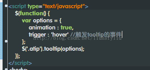
| trigger | string | 'hover focus' | How tooltip is triggered - click | hover | focus | manual. You may pass multiple triggers; separate them with a space. |
| viewport | string | object | { selector: 'body', padding: 0 } |
Keeps the tooltip within the bounds of this element. Example: |

上一篇 音频编码之opus
下一篇 poj1482(隐式图求最短路)
程序员人生,我编程,我富裕,记住wfuyu网,php教程,php学习,php手册,CMS模版制作
声明:本站大部分内容是作者原创,少部分收集于互联网供大家一起学习,原版权很多不明,如有侵权请联系本站,谢谢!
粤ICP备14040726号-1 2015-2020 程序员人生 版权所有


