
你会看到,不论是甚么布局,Flex常常都可以几行命令弄定。
我只列出代码,详细的语法解释请查阅《Flex布局教程:语法篇》。我的主要参考资料是Landon Schropp的文章和Solved by Flexbox。
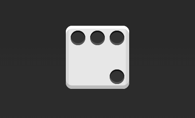
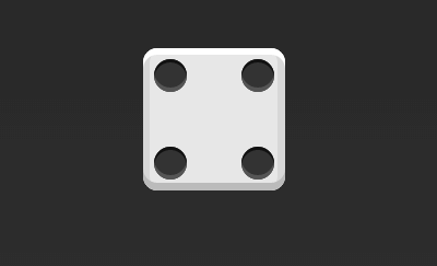
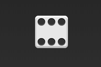
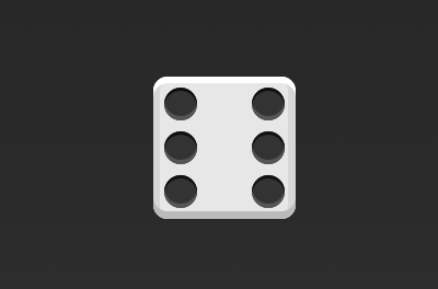
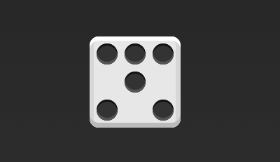
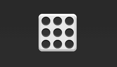
骰子的1面,最多可以放置9个点。
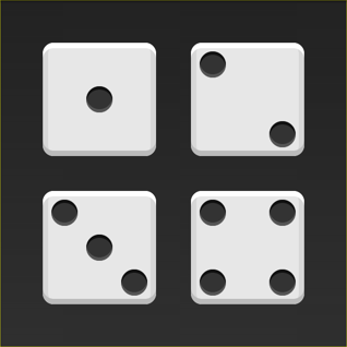
下面,就来看看Flex如何实现,从1个点到9个点的布局。你可以到codepen查看Demo。
如果不加说明,本节的HTML模板1律以下。
<div class="box"> <span class="item"></span> </div>
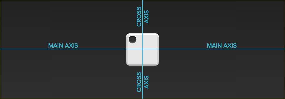
上面代码中,div元素(代表骰子的1个面)是Flex容器,span元素(代表1个点)是Flex项目。如果有多个项目,就要添加多个span元素,以此类推。
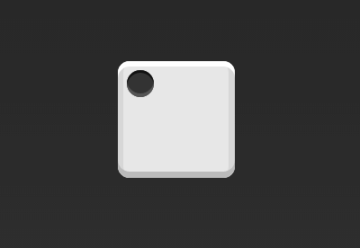
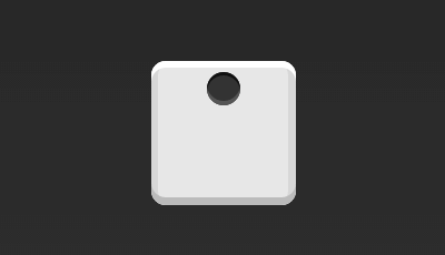
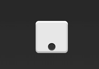
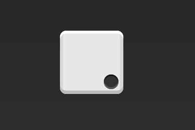
首先,只有左上角1个点的情况。Flex布局默许就是首行左对齐,所以1行代码就够了。
.box { display: flex; }
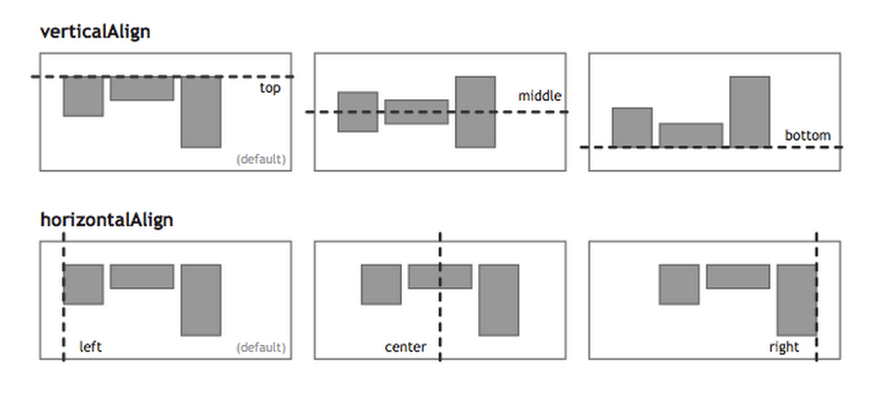
设置项目的对齐方式,就可以实现居中对齐和右对齐。
.box { display: flex; justify-content: center; }
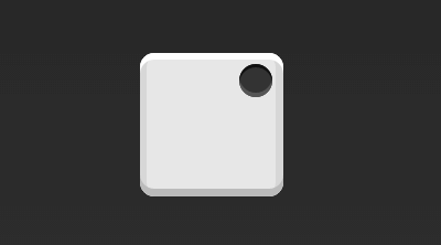
.box { display: flex; justify-content: flex-end; }
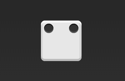
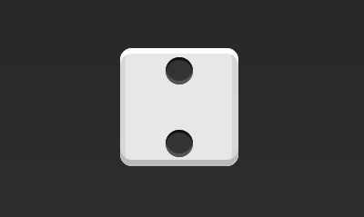
设置交叉轴对齐方式,可以垂直移动主轴。
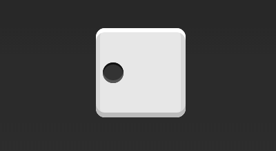
.box { display: flex; align-items: center; }
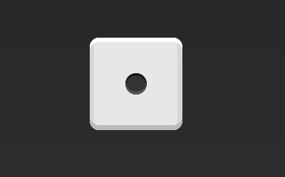
.box { display: flex; justify-content: center; align-items: center; }
.box { display: flex; justify-content: center; align-items: flex-end; }
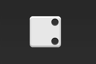
.box { display: flex; justify-content: flex-end; align-items: flex-end; }
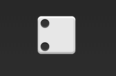
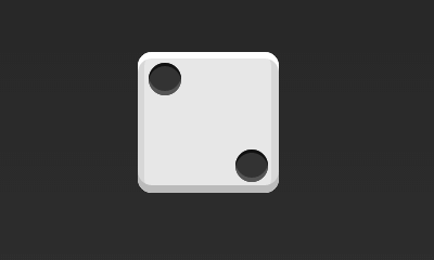
.box { display: flex; justify-content: space-between; }
.box { display: flex; flex-direction: column; justify-content: space-between; }
.box { display: flex; flex-direction: column; justify-content: space-between; align-items: center; }
.box { display: flex; flex-direction: column; justify-content: space-between; align-items: flex-end; }
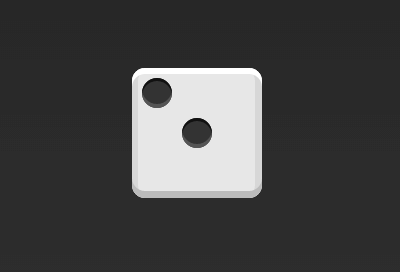
.box { display: flex; } .item:nth-child(2) { align-self: center; }
.box { display: flex; justify-content: space-between; } .item:nth-child(2) { align-self: flex-end; }
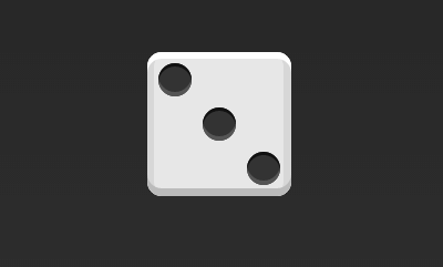
.box { display: flex; } .item:nth-child(2) { align-self: center; } .item:nth-child(3) { align-self: flex-end; }
.box { display: flex; flex-wrap: wrap; justify-content: flex-end; align-content: space-between; }
HTML代码以下。
<div class="box"> <div class="column"> <span class="item"></span> <span class="item"></span> </div> <div class="column"> <span class="item"></span> <span class="item"></span> </div> </div>
CSS代码以下。
.box { display: flex; flex-wrap: wrap; align-content: space-between; } .column { flex-basis: 100%; display: flex; justify-content: space-between; }
.box { display: flex; flex-wrap: wrap; align-content: space-between; }
.box { display: flex; flex-direction: column; flex-wrap: wrap; align-content: space-between; }
HTML代码以下。
<div class="box"> <div class="row"> <span class="item"></span> <span class="item"></span> <span class="item"></span> </div> <div class="row"> <span class="item"></span> </div> <div class="row"> <span class="item"></span> <span class="item"></span> </div> </div>
CSS代码以下。
.box { display: flex; flex-wrap: wrap; } .row{ flex-basis: 100%; display:flex; } .row:nth-child(2){ justify-content: center; } .row:nth-child(3){ justify-content: space-between; }
.box { display: flex; flex-wrap: wrap; }
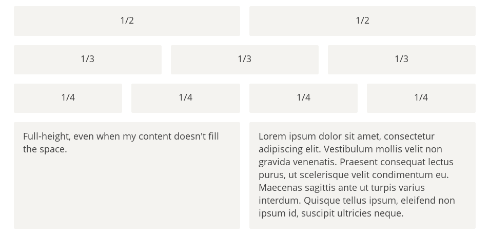
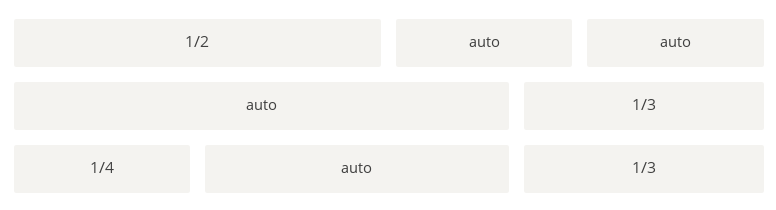
最简单的网格布局,就是平均散布。在容器里面平均分配空间,跟上面的骰子布局很像,但是需要设置项目的自动缩放。
HTML代码以下。
<div class="Grid"> <div class="Grid-cell">...</div> <div class="Grid-cell">...</div> <div class="Grid-cell">...</div> </div>
CSS代码以下。
.Grid { display: flex; } .Grid-cell { flex: 1; }
某个网格的宽度为固定的百分比,其余网格平均分配剩余的空间。
HTML代码以下。
 <div class="Grid"> <div class="Grid-cell u⑴of4">...</div> <div class="Grid-cell">...</div>
 生活不易,码农辛苦

 如果您觉得本网站对您的学习有所帮助,可以手机扫描二维码进行捐赠

上一篇 VC++调试常见错误总结
程序员人生,我编程,我富裕,记住wfuyu网,php教程,php学习,php手册,CMS模版制作
声明:本站大部分内容是作者原创,少部分收集于互联网供大家一起学习,原版权很多不明,如有侵权请联系本站,谢谢!
粤ICP备14040726号-1 2015-2020 程序员人生 版权所有


